Delivering a modern user experience (UX) with Salesforce Lightning
- December 31
- 7 Minute Read

At Certinia, we are committed to delivering the best user experiences while leveraging the latest advances and innovations on the Salesforce platform. Today that means utilizing Salesforce Lightning and the modular Lightning Web Components (LWC) to help us develop and deliver a modern User Interface (UI) – one that improves productivity, optimizes operations, builds and delivers apps faster–all while reducing costs.
In this blog post, the third in our three-part series about the Lightning Experience (LEX), we shift our focus from how we integrated the latest platform, foundation, and technical advances from Salesforce to how we are delivering a modern UI and UX with Lightning.
What is a Modern UX?
There are many definitions that can be used for describing a modern UX. At Certinia, a modern UX is not just about how it looks, it is about the characteristics that make up the interactions a user has. There are several themes we apply:
- Familiarity – Align to the platform patterns built upon Salesforce, and users will have known interactions along with consistent processes and experiences.
- Usability – Create an intuitive experience artfully aligned to business best practices.
- Efficiency – Enable users to act with confidence through predictable navigation and consistent information organization.
- Collaboration – Empower users to work together and share information relevant to each others’ roles.
- Flexibility – Allow customers and their users to modify pages and components to fit their business needs.
- Insights – Provide users the metrics they need to make intelligent business decisions in a timely, accurate manner.
- Automation – Ensure users have intelligent defaults and guided experiences to increase productivity.
- Mobility – Deliver solutions that are available across all mobile devices.
Lightning is a key advantage in delivering on these characteristics and one of the reasons why we are investing in Lightning and the LWC model. As functionality and interaction are added to a product such as Certinia’s, Visualforce can no longer meet the demands we are placing on it for a more modern UX. We view Lightning as a new opportunity to provide this modern UX and unshackle our experiences as we transition from the classic user experience and Visualforce technology.
Designing for our users
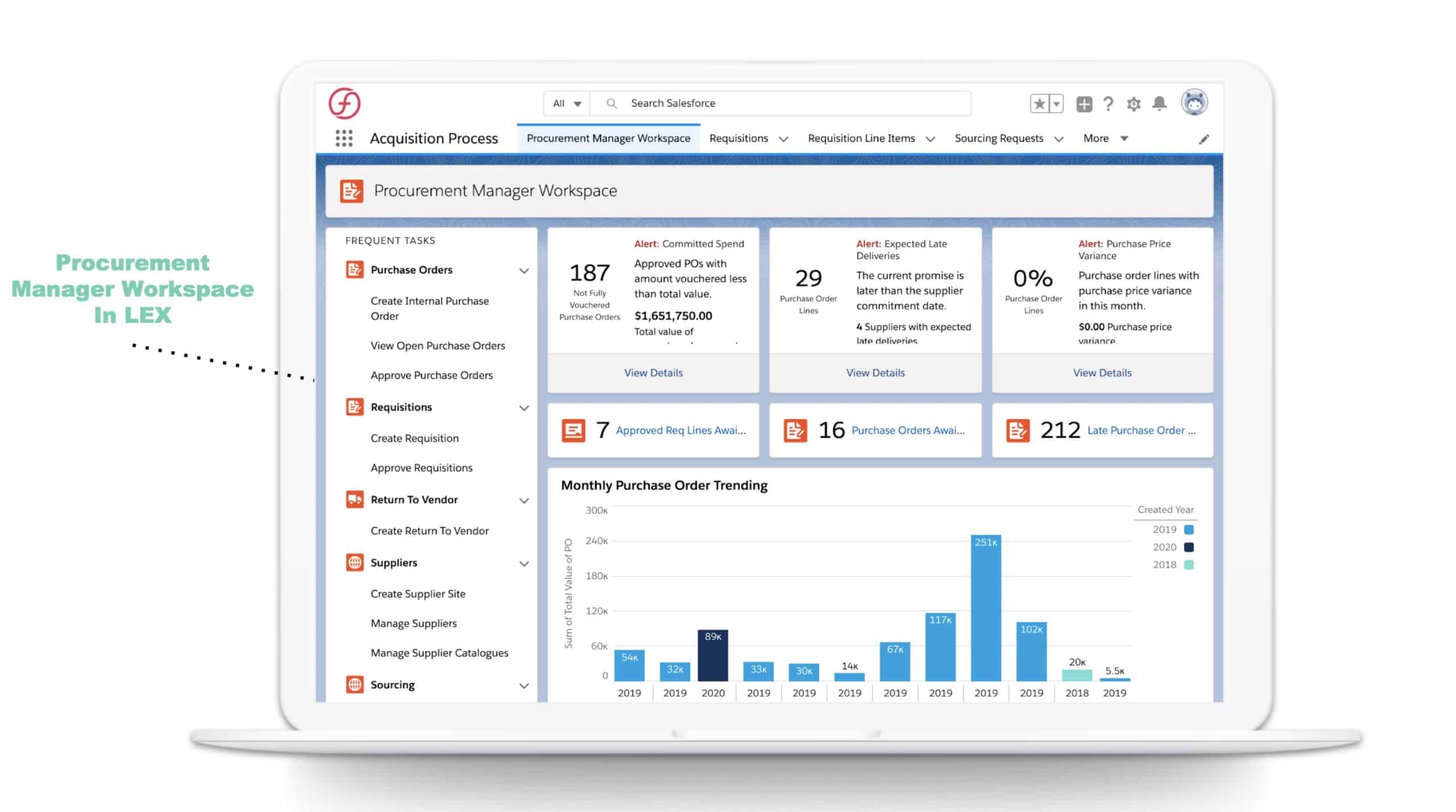
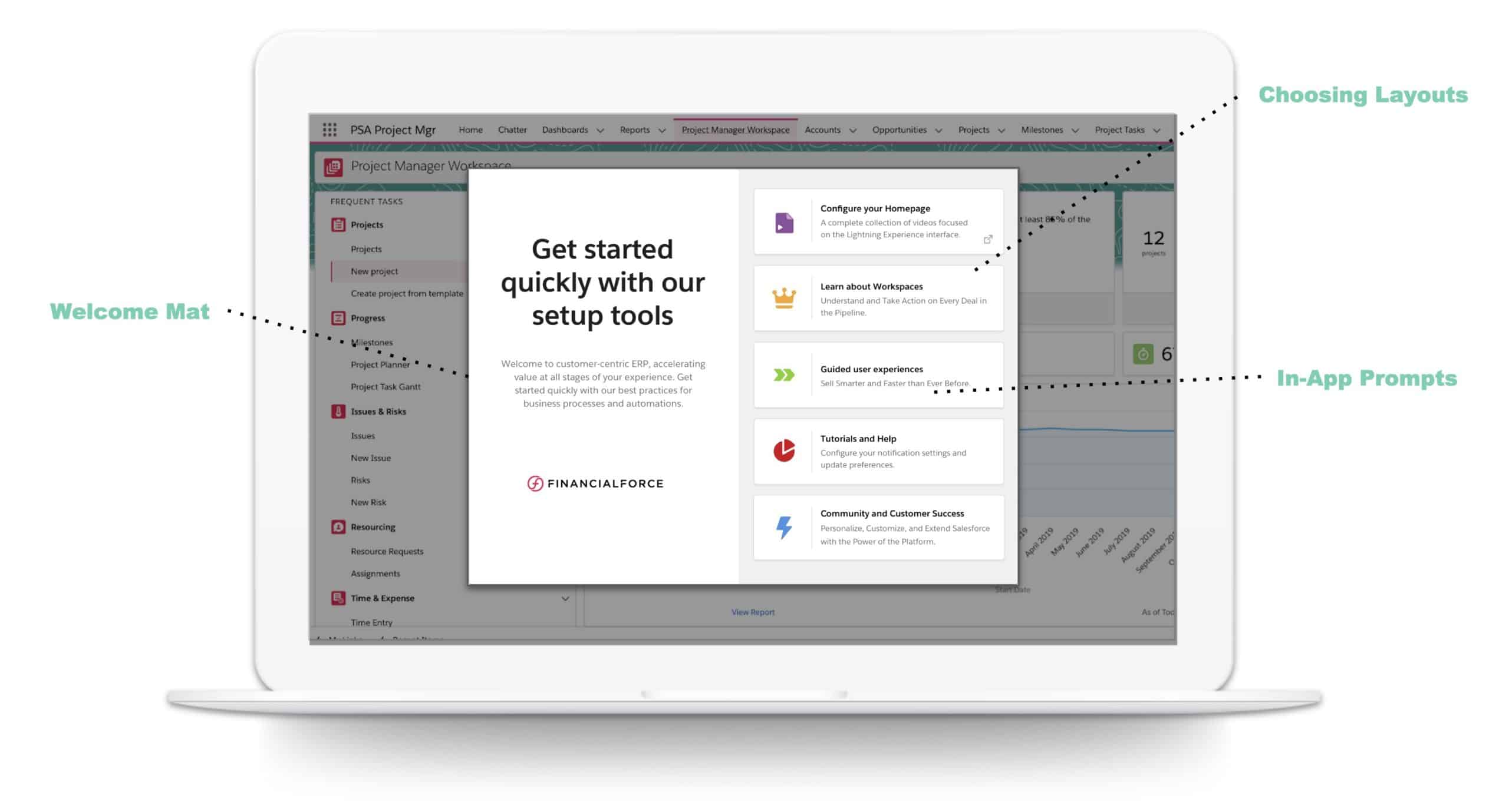
In the Summer ‘19 release of FinacialForce, we introduced Workspaces as a major step towards building experiences in Lightning. Workspaces are a homepage that is specific to a business role or persona, to help them do their jobs most effectively. They include key insights to help users spot and resolve potential issues; display tasks to assist users with prioritizing daily work; and provide access to the most commonly used areas of the application for ease of navigation. We now have several workspaces that have been released across our products.
At this same time (Summer ‘19), we started an initiative to drive alignment across the entire customer lifecycle to provide the best experiences. Our Accelerate process looks at every touchpoint that the customer has with our solutions and ensures that all interactions are seamless and consistent.
For our Spring ‘20 release, we did our first major transition from Visualforce to Lightning – with a team focused on converting one of our financial management applications. As they dove in, they were able to understand the opportunities and limitations of the Lightning system. It was clear that the patterns for Classic are different than the patterns in Lightning so we had to reimagine the workflows to enable them in Lightning. The team took the challenge in stride coming up with creative ways to tackle problems and setbacks. In the end, they were able to see the flexibility and opportunity as they transitioned between the old and new technologies.
To date, we have converted 42 Visualforce forms and 12 complex Sencha forms, all of which were full-page. Sencha was our solution for complex interactions and more complex processes. This included things that should have been other interaction patterns such as a dialog, but couldn’t be because of the limitations in Classic UI. After the conversion, while retaining the existing functionality, we reduced the full page forms by 35 and removed all of the Sencha forms.
What’s Next?
As we continue to transition the remaining applications, we intend to do more than just update the technology to Lightning. Our design teams have broken the upcoming enhancements up into the following themes:
Domain-specific components
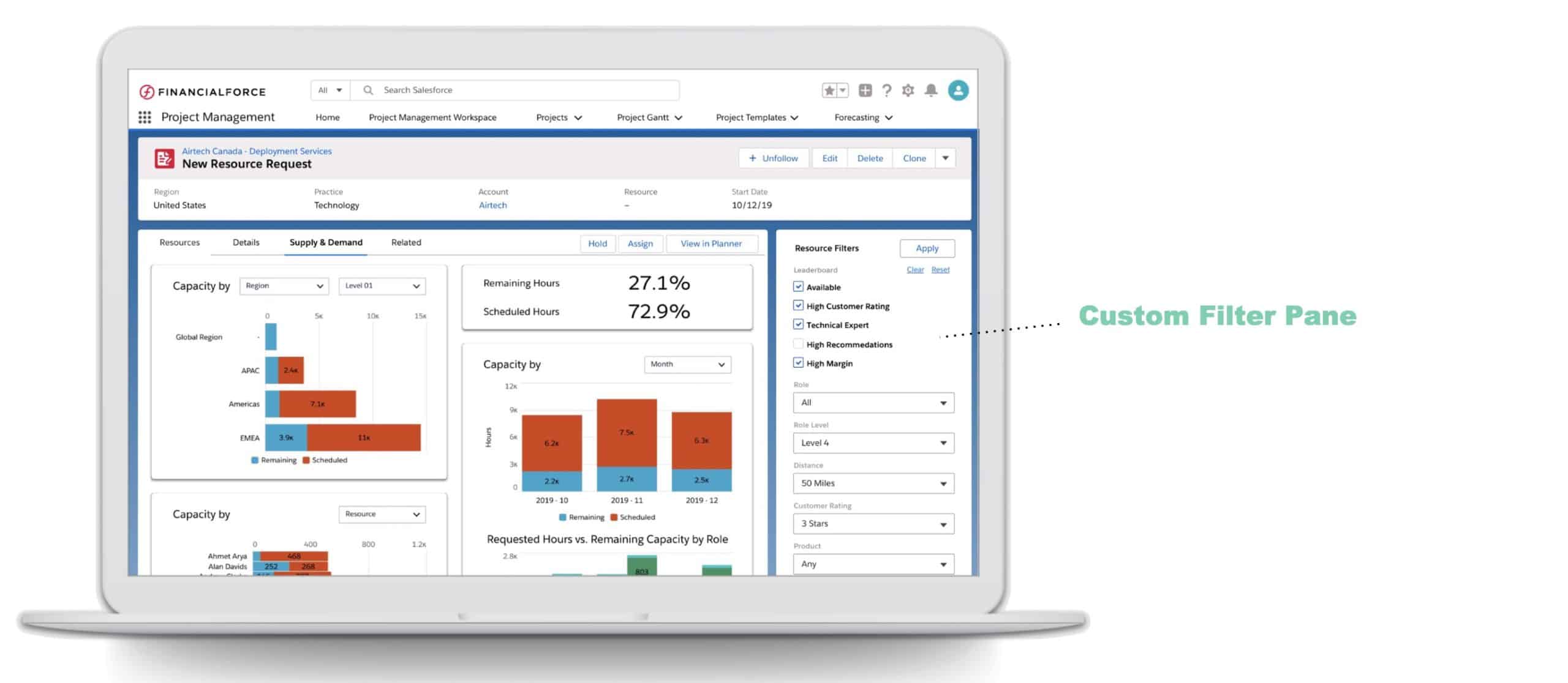
The flexibility of the Lightning Design System allows us to create components that provide data insights and automated processes to differentiate and disrupt. We are currently building out a library of flexible domain-specific components to give our customers a business advantage. Users can customize these components to fit their business needs in a clicks-not-code environment. In the image below, you can see the domain-specific components that were built for our professional services automation (PSA) product.
Embedded Analytics
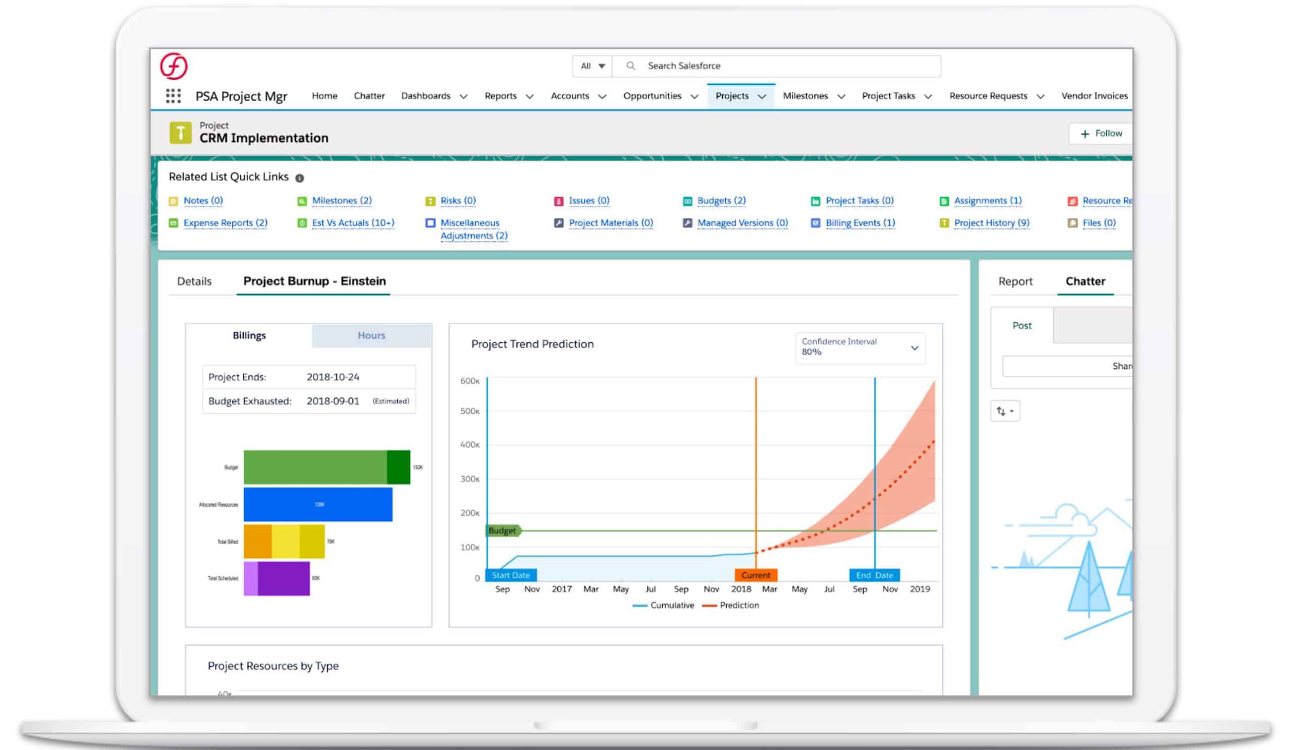
We will be providing users the metrics they need to make intelligent business decisions from within the UI. We are delivering this by leveraging the power of Einstein Analytics in a seamless experience within Lightning.
Information Architecture
We will also provide an updated information architecture and navigation model that leads to a more intuitive user experience. All the pieces will work together logically, by flowing from one location or object to the next, helping users get their jobs done more efficiently.
Workspaces
We will continue to create tailored workspaces for persona or process-based activities. We are also investing in the usability of the workspaces – with improved readability as well as easy customization.
It’s just the beginning
Although we have done a lot with Lightning and created some great new custom components, we are continuing to innovate and find ways to delight our users. We are working on additional experience that includes higher-level snapshots and overviews, guided experiences, improving the 360-degree view of your customer with more details including analytics, and helping users prioritize their work with insights and suggestions, even down to the task level.
As Stephen Willcock, Certinia Chief Architect, discussed in his blog From Visualforce to Lightning: the Certinia Journey of innovation on Salesforce we have been on a great multi-year technical journey with Salesforce since we launched our company in 2009. We have embraced each introduction of technology from Apex code, Visualforce, the Aura development model and now the Lightning component framework to deliver better business processes.
With Farhan Sheikh, Certinia Product Engineering Manager’s, blog A migration story: Certinia journey to Salesforce Lightning, and the downloadable white paper The Certinia Journey To Salesforce Lightning he shares the programmatic and business process changes we made across our application portfolio to maximize the flexibility now being created by Salesforce Lightning Experience (LEX).
With the relationship that we have with Salesforce, the power of Lightning, and the experiences that we will deliver in upcoming releases, you would be hard-pressed to find a more exciting time to be on the Certinia platform.
You can see how our modern UIs help users improve productivity and optimize operations in these quick two-minute videos on our cloud ERP and professional services automation (PSA) solutions.
Recent Articles
Maximize your Salesforce investment with Certinia


